Heyo folks. This post is to go over some of the things relating to my latest art and animation posts, specifically for both the background and character design!
CHARACTER DESIGN:
Fun fact: this is the first rig I have made which is drawn using brush tools instead of just using the line tools and stroke styles!
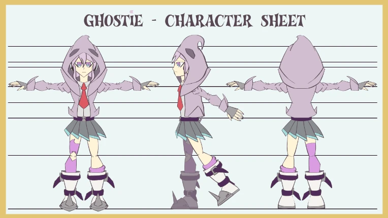
This greatly gives the lines a lot more of a "natural" look rather than the kinda sometimes cheap and too equal/even Line Tool strokes. It also make it much quicker to edit and change asset appearances (probably not much of a surprise for people who have used the Brush tools for a while, but it's certainly a fresh feeling to me!)
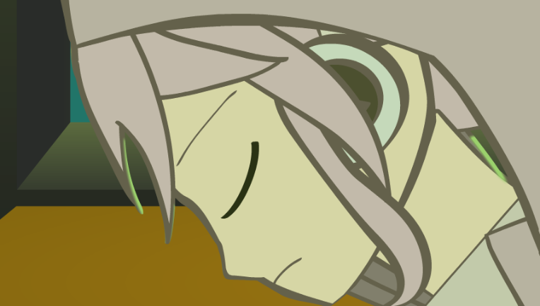
I didn't use too many variation of parts like the hands and eyes for this animation, as the body movements were the larger focus. Although I did use a closed eye variant for Ghostie when she was blinking.
BACKGROUND:
When I made an earlier version of this particular test animation: I didn't have a background suitable for this animation, so I quickly made a very rushed classroom background, with a different colour scheme.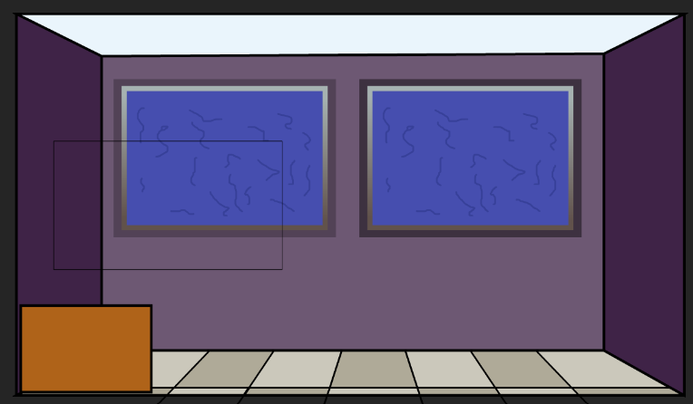
(The desk was simply a brown box off-screen, just something as a guide point to where Ghostie's hands needed to be resting on. The plan was for her to be searching through things inside the shelf, not on top.)
This prompted a major redesign of the classroom BG, one that would fit the tone of the character (and any other future ones).
I started by doing an overall sketch of what I wanted for the room, including design, background items and props.
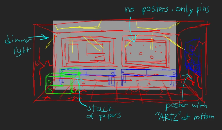
For clearer context:
Red - background
Blue - items (not usually interacted or animated)
Green - items meant to be animated
Yellow - lights
Cyan - notes
I then established the base colours for everything.
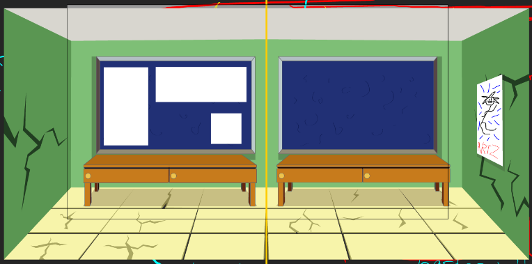
(Shelf and paper stack were not made by this point, but just imagine them being the same colours as the desks and posters.)
I then add the lights and started messing with gradients and colours to get the colours to match.
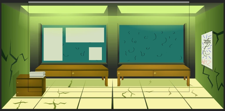
(Went for a greenish deco to make the room more eerie.)
Added in some pins to make it look like the posters were stuck onto the board by something. 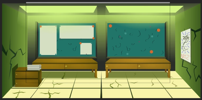
One of my Discord friends commented on using a special brush for the boards, since they're supposed to be more of a fuzzy fabric texture.
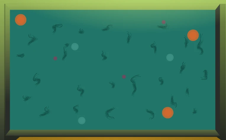
And voila! The background is complete! Now you have an awesome looking worn classroom background for your characters to vacate! :D
And that's about it for this update! Thanks for listening through about me discussing stuff about animation!
If you wanna support me, consider following me on my Twitter, YouTube, Instagram, and Pixiv accounts!
TWITTER: https://twitter.com/KiraPrismArt
YOUTUBE: https://www.youtube.com/channel/UCEKWSGA5YQGLPhtirEG9gCA
INSTAGRAM: https://www.instagram.com/prismstartist/